Building Smarter Offices: Safely Stealing Conference Rooms
At Huge, we spend the majority of our time solving complex problems for clients, but our culture of continuous improvement sometimes leads us to internal projects that vastly improve how efficiently we work. Regardless of the wide variety of projects they are undertaking, our team members often have very similar needs--and that includes conference rooms. No matter what you’re working on, you’ll need to schedule meetings, collaborate with team members, and occasionally want to just find a nice, quiet space to be creative.
Conference-room scheduling is a pain point for most organizations as they grapple with limited room availability and juggling the needs of multiple teams that need to occupy those spaces. Scheduling the meetings themselves often requires human intervention to understand the nature of what each team needs, and then matching those needs with the proper conference rooms. Letting team members know the schedule for what meetings are going on in each conference room, when it will next be available, and quickly letting them book a meeting in a free room are communication problems that we can use software to solve.
Where Conference-Room Calendars Fail.
Let’s look at the why meeting scheduling can be so painful. Consider the common scenario of needing to book a conference room for an hour, and you need it in the next 5 minutes. Let’s assume each of your conference rooms has a shared calendar (such as Outlook or Google) where you can view what meetings are scheduled. The first question is: “What rooms are free right now, and are they free for the next hour?” Some potential solutions:
- Walk around and see what conference rooms appear to be empty. Even if no one is in the conference room right now, you can’t be sure that someone else hasn’t booked the room for the next hour.
- Sit at your desk and check the calendars for each room individually. Even if you find one that’s free, someone else may be occupying it at this moment for an important meeting even if they didn’t officially book the conference room on a calendar. Someone may also have forgotten to properly cancel their meeting, thus leaving an open room listed as occupied.
The fundamental problem here is that you have two sets of data that you need to mentally reconcile before making a decision, but it’s difficult to evaluate them at the same time.
The solution to this problem is being able to view a conference room’s official schedule while you can physically see what is going on in the room. Taking this a step further, someone should be able to quickly book a meeting once they found a room that they could use. This ensures that the official schedule for the conference room is now up to date since the room is now taken. We could walk around with our laptops open while checking the schedule for each conference room as we glance in them, but that solution seemed clunky.
Making The Workday Better.
Since we can easily view the schedule for a conference room and book a meeting at our desk, why can’t we just do those same things on a small tablet display mounted outside each conference room?
This way we could see the official schedule for a conference room while knowing if anyone is actually using it. There are existing solutions on the market that partially address these problems, but we wanted to build our own so we could have complete control over the experience and fully integrate it with various other smart office capabilities we’re developing. For instance, new facial-recognition technology will allow us to digitally greet arriving clients and guide them to the right meeting space by syncing with our conference-room tech.
The end goal would be to have a tablet mounted outside of each conference-room door, with the following capabilities:
- Display if a conference room is open or what meeting is currently taking place in the room.
- Show who created the current meeting and what time it will be over.
- Display the schedule for a conference room for the rest of the day.
- Allow a user to quickly create a meeting if a room is free and they want to use it.
After we established the vision for what we wanted to build, two streams of work began. A UX expert constructed wireframes and designs for how the application should look and feel while meeting our rough requirements. We also investigated the technical feasibility of our plan, prototyping and mitigating technical blockers such as:
- Is it possible to access the conference-room schedule data via an API?
- Should we design a web-based solution or a native app on the tablets?
- Will we need a server to consolidate this data and if so, where should it live?
- What tablets would work best for this and is there a way to attractively mount them on walls?
- How can we keep tablets continuously powered?
- How can we remotely administer all of the tablets to push out updates?
These are not questions that we needed to have 100% answered to proceed, but we needed a reasonable certainty that none of them would pose risks to the overall success of the project. Creating some early prototype applications to pull calendar data and researching hardware options gave us that confidence. The two streams of work then merged, with our UX expert working with an engineering lead to define a base feature set for the first version of the application.
HelloRoom.
With confidence that there were no major technical blockers and a fresh set of wireframes in hand, our engineering teams in Washington, D.C. and Bogota, Colombia set to work on transforming UX documents into an app that we hoped would make our coworkers’ busy days better.
We named the application HelloRoom as an ode to Huge’s company culture of openness and friendliness. We wanted the conference rooms themselves to seem more approachable and helpful for employees, and letting them convey information would get us there.
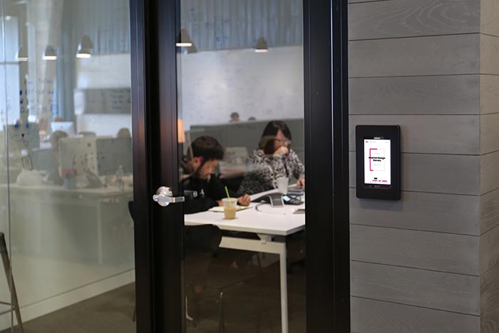
Our first release of the application was completed in one month with an MVP approach; the only features were to see what meeting was currently going on and which meeting was next. A single iPad was deployed to run the application in front of one conference room. The tablet itself would be removed to be charged at night and then mounted back outside the conference room (with velcro) every morning. The server for the application was a spare Mac Mini.
The feature set was minimal, the technical architecture had potential problems, and charging the tablet every night was clunky, but we quickly received feedback from everyone in the office that they loved it, and they had great suggestions on what features to build next.
This validation proved that we were onto the right idea, building something meaningful, and that investing further time in the project was worthwhile. We had proven a key assumption, that people would actually find the application useful. Furthermore, if we didn’t put the tablet up one day, folks would ask where it was.
At this point, we paused to define the steps to move the project from an experiment to a dependable application that employees could rely on every day. This is an extremely critical step that many startups and side projects overlook, with the unfortunate consequences of accruing mountains of technical debt. To take the project to the next level we needed to:
- Set a product backlog/roadmap of features.
- Define a process for working on features and bugs such as Kanban in JIRA.
- Migrate to a more stable server.
- Identify key refactoring in the codebase for any parts of the MVP that needed it
- Define an automated deployment for releases
- Figure out a better configuration for hardware and power
These were the more engineering-focused steps that were easy to define. We also started to reach out to other offices in the Huge network to see if they would be interested in using the application and helping to build the next iteration. The response was fantastic and we gained momentum with each new team member who was excited to work on the project. A year later, we have a robust application that our employees use daily. Let’s take a look at what we built.
Featureset: “Do Not Disturb” and “Steal Me.”
The app is designed to run on a tablet either in portrait or landscape mode and adjusts its design to fit the available screen real estate.
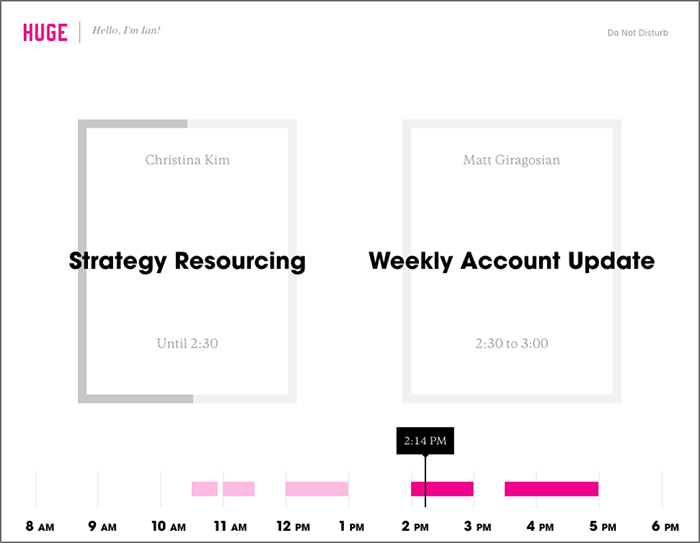
The name of each conference room is displayed at the top of the layout with information on both the current and upcoming meeting directly below it. Users can also swipe to view details on what meetings are taking place throughout the rest of the day. Information on each meeting is shown such as who owns it, the name of the meeting, and what time it starts and ends. The dark gray border of the meeting also adjusts clockwise to indicate how much time is left in meeting.
Below the meeting information is a timeline for the day that shows when the room is booked and what times it is free throughout the day. Previous meetings are a lighter shade of magenta to indicate that they’ve already happened. A current time indicator is also placed on the timeline to help users gain a better view of what’s currently going on in the room.
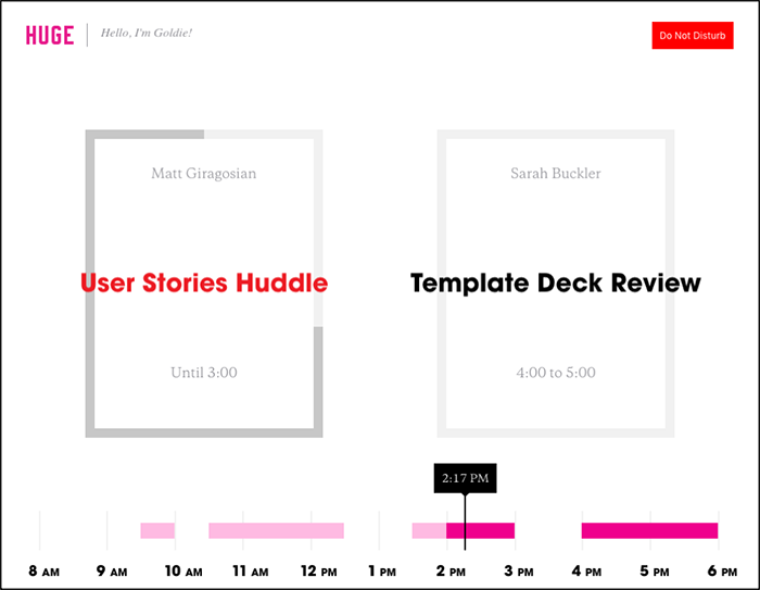
In the upper right of the application there is also a button for Do Not Disturb which can be used to indicate that a meeting should not be interrupted. Touching this button will also change the title of the meeting to red to make this status more visible. Touching the button a second time will disable this functionality or it will reset to normal when the current meeting is over.
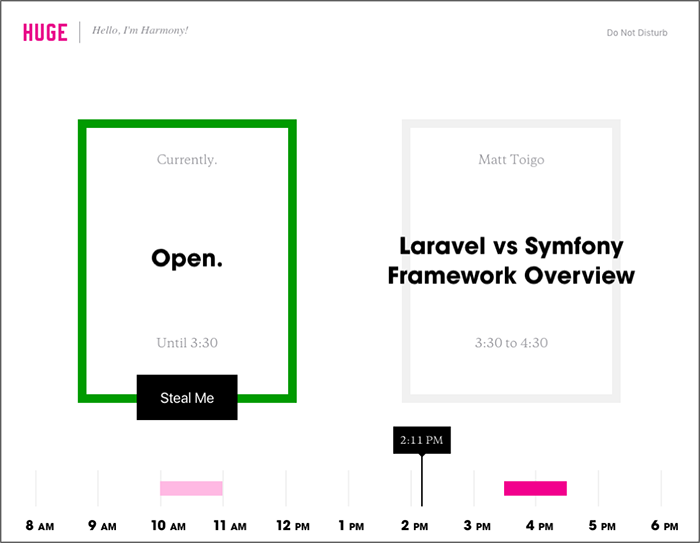
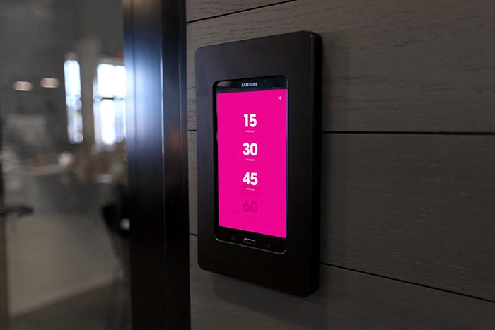
If a meeting room is open, a user can use the Steal Me feature, which lets them book a meeting right at the conference room. After touching Steal Me, a user is prompted for how long they want the room. This feature is also intelligent and only allows a user to create a meeting that will not run longer than the available free time.
Tech Stack.
This project provided us with an opportunity to use any technologies we thought would be best so we constructed a web application built with Node.js, Express, SASS, and Angular. This struck a nice balance between what our team members wanted to work with and set us up with a platform that had previously proven perfect for rapid development. Building a web-based app meant that our solution could easily be run on Android or iOS tablets of any size.
The application works by using Node.js to authenticate as a Google user and then query the Google Calendar API to get a list of events that are happening in each room. Google refers to each conference room as a “resource” and each resource has its own calendar showing when that resource is available or busy. Javascript iterates through the list of events (meetings) for the resource (room) and then Angular is used to bind the list of events to the UI. The list of events is then compared against the current time to determine what event is currently taking place in the room. Creating events from the application also simply just sends a POST request to Google’s API with the details on the new meeting that should be created.
To run the application outside of our conference rooms, we went with Samsung Galaxy 4 7” tablets. These are relatively cheap and run Android, which provides a wide array of functionality for administering kiosks in public locations. These particular tablets also have attractive mounting enclosures provided by Vidabox which hide the edges of the tablet and allow a power source to be routed from behind.
When we first tested the original version of HelloRoom, we didn’t have the luxury of power running to our tablet outside of our conference room. Luckily, Huge DC was in the process of moving into a new office space, which gave us the opportunity to come up with a better solution for powering the tablets. We worked with a construction manager to run power to the walls directly outside of our conference rooms. We ended up using power over ethernet since CAT5 cable is easier to run through tight spaces than traditional electrical wiring and also has the advantage of not needing to be exposed via electrical outlets. Vidabox also makes converter boxes which convert ethernet power to Micro USB power that can be fed directly to the tablets, thus keeping them fully charged at all times.
Specialized software is used to ensure that the tablets load up the application on startup and lock out all other functionality. This also allows them to all be remotely monitored, updated, and also powered off at night to save energy.
What We Learned.
We’ve been using the tablets in our Huge DC office for a year and the response has been great. There’s no more rushing or scrambling to find meeting rooms, so there's a daily payoff for the majority of our employees. Huge Bogota has also deployed the application successfully and there are plans to roll it out for other offices in the Huge network. Another office forked the original codebase and is customizing it, since we’ve noticed that each office has slightly different preferences in how they want to use the application.
We’re now continuing with various enhancements and new features as we gain more valuable feedback from a larger user base. Exciting features that are in development are allowing office administrators to coordinate room scheduling for offices with a large number (40+) of conference rooms, analyzing past meeting data, and using machine learning to predict future scheduling patterns for rooms.